Note from Ray: This is the fifth iOS 6 tutorial in the iOS 6 Feast! In this tutorial, we’re updating one of our older tutorials to iOS 6 so it’s fully up-to-date with the latest features like the new UIKit controls that can be customized in iOS 6.
Parts of this tutorial come from Steve Baranski and Adam Burkepile’s chapters in iOS 5 and iOS 6 by Tutorials, although the book covers a lot more than this simple example, such as beautifying table views, dynamically theming your apps, and more. Enjoy!
Update 9/22/12: Fully updated for iOS 6 by Adam Burkepile.
10/12/11: Original post by Steve Baranski.
To be successful on the App Store, your app needs to stand out. The vanilla user-interface “look and feel” provided by Apple just doesn’t cut it any more in a crowded market.
Many of the most popular apps on the App Store present standard iOS UI elements in a non-standard fashion:
- Twitter employs a custom UITabBar
- Instagram uses both a custom UITabBar and a custom UINavigationBar
- Epicurious for iPad customizes elements of the standard split-view interface
Prior to iOS 5, many developers had to take somewhat unconventional approaches to achieve these results. Although subclassing and overriding drawRect: was the recommended approach, many resorted to the dreaded “method swizzling”.
But with iOS 5 and above, those dark days are over! iOS 5 added a bunch of new APIs you can use to easily customize the appearance of various UIKit controls, and iOS 6 added even more.
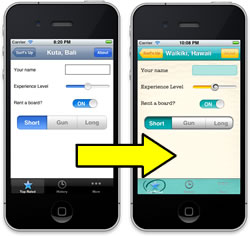
To illustrate some of these new APIs, in this tutorial we’re going to take a “plain vanilla” app about surfing trips and customize the UI to get a more “beach-themed” look-and-feel.
To get the most out of this tutorial, you need to know the basics of iOS development first. If you are new to iOS development, you should check out some of the other tutorials on this site first.
Getting Started
To begin, download the the starter project. I’ve created a simple app for you to start with so you can focus on the meat of this tutorial – UIKit customization.
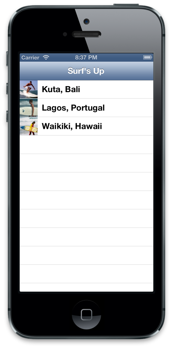
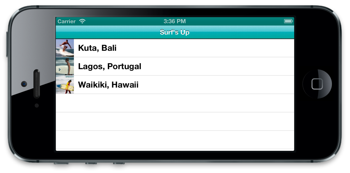
Once you open up the project, take a look around the code and XIBs. You’ll see that the primary view presents a list of our surfing trips, and the detail view allows us to capture more information about each trip individually.
With that context, Build & Run the app (Cmd-R) to see what you have to start with.
Huh. Yes, this app is functional, but it’s hardly representative of the fun one would expect to have on a surfing trip. Let’s survey the scene in more detail.
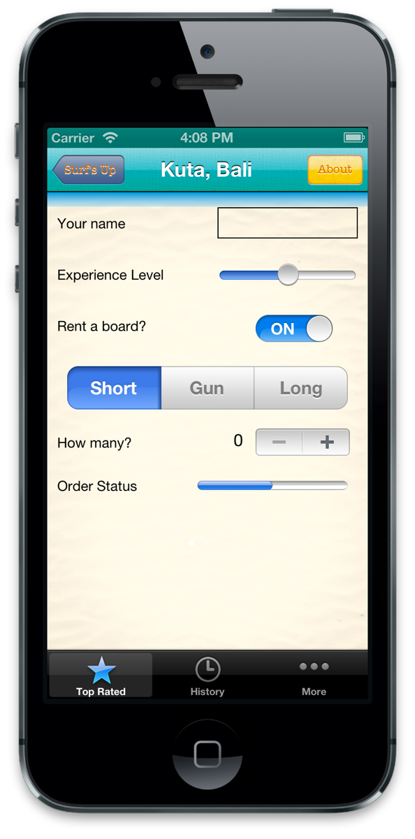
Let’s start with the detail page. Things look pretty standard there, eh?
A plain UIBarButtonItem on the UINavigationBar at the top, stock UITabBar elements at the bottom, and the following “standard” data entry components including the following:
- UILabels with “System” Helvetica fonts
- UITextField
- UISlider
- UISwitch
- UISegmentedControl
- UINavigationBarShadow
- UIStepper
- UIProgressView
- UIPageControl
In this tutorial, you’ll completely customize the detail screen to give it some style, using the new APIs available in iOS 5 and 6. So with an idea of what’s in store, let’s convert this app from “zero” to “hero”.
Adding a Background Image
If you open up the Images folder in your project, you’ll see that you already have some images you can use to customize the UI included in the project – you just need to modify the code to make use of them.
Inside the images folder is a file called bg_sand.png. We’re going to start our UI customization by making this the background image in the detail view.
Open DetailViewController.m and create a viewDidLoad method like this:
- (void)viewDidLoad { [super viewDidLoad]; self.view.backgroundColor = [UIColor colorWithPatternImage:[UIImage imageNamed:@"bg_sand"]]; } |
If you aren’t familiar with this technique, you can actually make a “color” based on an image like you see here. This is an easy way to set the background of a view, because there’s no “backgroundImage” property, but there is a “backgroundColor” property!
Compile and run to verify that it worked:
I can feel the sand between our toes already!
Customizing UINavigationBar
If you look inside the images folder, you’ll see two images that you want to use to customize the navigation bar: surf_gradient_textured_32.png and surf_gradient_textured_44.png.
You want to repeat these from left to right across the navigation bar. there are two different heights because the height of the navigation bar shrinks when the phone goes into landscape.
iOS 5 offers two new APIs that can help us with this:
- UINavigationBar has a new backgroundImage property you can use to set a custom background image like this.
- UIImage has a new resizableImageWithCapInsets method you can use to create a resizable image. The cap insets allow you to specify the portions of the image that should not be repeated, such as if you have rounded corners for a button on the edges that shouldn’t be repeated.
You could go into the detail view and use these new APIs to set the navigation bar’s background image directly. But then you’d have to go and do the same thing inside our list view, and any other views you might have in our app!
Obviously this would get old quick. Recognizing this, iOS 5 offers a cool new feature that allows us to customize user interface elements once, allowing it to “stand in” for other elements within the same level in the containment hierarchy.
So starting with the navigation bar, we’re going to use this concept of the “appearance proxy” to customize some elements that will be repeated throughout the app.
Let’s see how it looks. Inside SurfsUpAppDelegate.m, create a new method right above application:didFinishLaunchingWithOptions:
- (void)customizeAppearance { // Create resizable images UIImage *gradientImage44 = [[UIImage imageNamed:@"surf_gradient_textured_44"] resizableImageWithCapInsets:UIEdgeInsetsMake(0, 0, 0, 0)]; UIImage *gradientImage32 = [[UIImage imageNamed:@"surf_gradient_textured_32"] resizableImageWithCapInsets:UIEdgeInsetsMake(0, 0, 0, 0)]; // Set the background image for *all* UINavigationBars [[UINavigationBar appearance] setBackgroundImage:gradientImage44 forBarMetrics:UIBarMetricsDefault]; [[UINavigationBar appearance] setBackgroundImage:gradientImage32 forBarMetrics:UIBarMetricsLandscapePhone]; // Customize the title text for *all* UINavigationBars [[UINavigationBar appearance] setTitleTextAttributes: [NSDictionary dictionaryWithObjectsAndKeys: [UIColor colorWithRed:255.0/255.0 green:255.0/255.0 blue:255.0/255.0 alpha:1.0], UITextAttributeTextColor, [UIColor colorWithRed:0.0 green:0.0 blue:0.0 alpha:0.8], UITextAttributeTextShadowColor, [NSValue valueWithUIOffset:UIOffsetMake(0, -1)], UITextAttributeTextShadowOffset, [UIFont fontWithName:@"Arial-Bold" size:0.0], UITextAttributeFont, nil]]; } |
The first two lines create stretchable images using the resizableImageWithCapInsets method discussed earlier. Note that this method replaces stretchableImageWithLeftCapWidth:topCapHeight:, which is now deprecated.
For the cap insets, you basically specify the fixed region of a given image in top, left, bottom, right. What’s left is stretched over the remainder of the region to which the image is applied. In this particular image you want the whole thing stretched, so you pass 0 for all of the fixed caps.
The next two lines invoke the appearance proxy, designating these stretchable images as background images, for the bar metrics specified.
The last line stylizes the title that appears in our detail view. To do so, you pass a dictionary of title text attributes. The available keys include the following:
- UITextAttributeFont
- UITextAttributeTextColor
- UITextAttributeTextShadowColor
- UITextAttributeTextShadowOffset
Almost done – just add the line to call this method at the top of application:didFinishLaunchingWithOptions:
[self customizeAppearance]; |
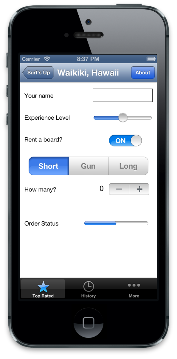
Compile and run, and now you should see the navigation bar has the teal background image applied in both orientations, with stylized title text as well!
Changing the UINavigationBar Shadow
One of the new things that was added in iOS 6 was a small shadow underneath the navigation bar that adds a nice little transition from the navigation bar to the content. You also have the ability to customize that shadow to something else. Let see how easy that is to do now.
You already have the image “navBarShadow” and “navBarShadow@2x” added to the project so just add the following line to the bottom of your customizeAppearance method:
[[UINavigationBar appearance] setShadowImage:[UIImage imageNamed:@"navBarShadow"]]; |
Build and run.
Viola! Easy, huh? Kinda like a nice cool wave flowing up the sand.
Customizing UIBarButtonItem
Open up the Images directory and look at button_textured_24.png and button_textured_30.png. You want to use these to customize the look and feel of the buttons that appear in the UINavigationBar.
Notice that we’re going to set up these button images as resizable images. It’s important to make them resizable because the button widths will vary depending on what text is inside.
For these buttons, you don’t want the 5 leftmost pixels to stretch, nor the 5 rightmost pixels, so you’ll set the left and right cap insets to 5. The pixels in between will repeat as much as is needed for the width of the button.
Let’s try this out! You’ll use the appearance proxy to customize all the UIBarButtonItems at once, like you did last time. Add the following code to the end of customizeAppearance:
UIImage *button30 = [[UIImage imageNamed:@"button_textured_30"] resizableImageWithCapInsets:UIEdgeInsetsMake(0, 5, 0, 5)]; UIImage *button24 = [[UIImage imageNamed:@"button_textured_24"] resizableImageWithCapInsets:UIEdgeInsetsMake(0, 5, 0, 5)]; [[UIBarButtonItem appearance] setBackgroundImage:button30 forState:UIControlStateNormal barMetrics:UIBarMetricsDefault]; [[UIBarButtonItem appearance] setBackgroundImage:button24 forState:UIControlStateNormal barMetrics:UIBarMetricsLandscapePhone]; [[UIBarButtonItem appearance] setTitleTextAttributes: [NSDictionary dictionaryWithObjectsAndKeys: [UIColor colorWithRed:220.0/255.0 green:104.0/255.0 blue:1.0/255.0 alpha:1.0], UITextAttributeTextColor, [UIColor colorWithRed:1.0 green:1.0 blue:1.0 alpha:1.0], UITextAttributeTextShadowColor, [NSValue valueWithUIOffset:UIOffsetMake(0, 1)], UITextAttributeTextShadowOffset, [UIFont fontWithName:@"AmericanTypewriter" size:0.0], UITextAttributeFont, nil] forState:UIControlStateNormal]; |
This looks familiar. You create the stretchable images for the buttons and set them as the background for both display in both portrait & landscape orientation. You then format the text to match the typewriter-style font you saw at the outset of the tutorial.
Note you can set different images for different types of buttons such as the “Done” type.
The “back” bar button item needs special customization, because it should look different – like it’s pointing backwards. Take a look at the images we’re going to use to see what I mean: Images\button_back_textured_24.png and Images\button_back_textured_30.png.
Add the following code at the bottom of customizeAppearance to take care of the back bar button item:
UIImage *buttonBack30 = [[UIImage imageNamed:@"button_back_textured_30"] resizableImageWithCapInsets:UIEdgeInsetsMake(0, 13, 0, 5)]; UIImage *buttonBack24 = [[UIImage imageNamed:@"button_back_textured_24"] resizableImageWithCapInsets:UIEdgeInsetsMake(0, 12, 0, 5)]; [[UIBarButtonItem appearance] setBackButtonBackgroundImage:buttonBack30 forState:UIControlStateNormal barMetrics:UIBarMetricsDefault]; [[UIBarButtonItem appearance] setBackButtonBackgroundImage:buttonBack24 forState:UIControlStateNormal barMetrics:UIBarMetricsLandscapePhone]; |
Note that you use different cap inset values because the back image has a wider left hand side that shouldn’t stretch. Also note that there is a separate property on UIBarButtonItem for “backButtonBackgroundImage” that you use here.
Compile and run, and you should now see some cool customized UIBarButtonItems in your UINavigationBar!
Customizing UITabBar
To customize a UITabBar, iOS 5 offers an API to let you change the background image of the toolbar, and the image to indicate the selected item. Take a look at Images\tab_bg.png and Images\tab_select_indicator.png to see the images you’ll use for these.
Although your mockups only depict one UITabBar, these will in all likelihood have the same appearance if others appear, so you’ll use the appearance proxy to customize this as well.
Add the following code to the bottom of customizeAppearance:
UIImage *tabBackground = [[UIImage imageNamed:@"tab_bg"] resizableImageWithCapInsets:UIEdgeInsetsMake(0, 0, 0, 0)]; [[UITabBar appearance] setBackgroundImage:tabBackground]; [[UITabBar appearance] setSelectionIndicatorImage: [UIImage imageNamed:@"tab_select_indicator"]]; |
Compile and run again…nice! The background and selected image are nice touches.
Note you can also specify “finished” and “unfinished” images if you wish to modify the manner in which the selected & unselected images appear.
Customizing UISlider
Open up Images\slider_minimum.png, Images\slider_maximum.png, and Images\thumb.png to see the images that we’re going to use to customize the UISlider.
iOS 5 makes it ridiculously easy to customize the UISlider by just setting the “maximumTrackImage”, “minimumTrackImage”, and “thumbImage” properties of a UISlider.
Let’s try it out. Add the following code to the bottom of customizeAppearance:
UIImage *minImage = [[UIImage imageNamed:@"slider_minimum.png"] resizableImageWithCapInsets:UIEdgeInsetsMake(0, 5, 0, 0)]; UIImage *maxImage = [[UIImage imageNamed:@"slider_maximum.png"] resizableImageWithCapInsets:UIEdgeInsetsMake(0, 5, 0, 0)]; UIImage *thumbImage = [UIImage imageNamed:@"thumb.png"]; [[UISlider appearance] setMaximumTrackImage:maxImage forState:UIControlStateNormal]; [[UISlider appearance] setMinimumTrackImage:minImage forState:UIControlStateNormal]; [[UISlider appearance] setThumbImage:thumbImage forState:UIControlStateNormal]; |
Compile and run, and check out your cool and stylish UISlider!
 0
0
Customizing UISegmentedControl
Now you’ll customize your segmented control. This component is a little bit more complicated, as you have both selected & unselected backgrounds, as well as varying states for the adjacent regions (e.g., selected on left, unselected on right; unselected on the left & selected on the right; unselected on both sides).
Take a look at the images you’ll use for this to see what I mean: Images\segcontrol_sel.png, Images\segcontrol_uns.png, Images\segcontrol_sel-uns.png, and Images\segcontrol_uns-uns.png.
Then add the code to make use of these to the bottom of customizeAppearance:
UIImage *segmentSelected = [[UIImage imageNamed:@"segcontrol_sel.png"] resizableImageWithCapInsets:UIEdgeInsetsMake(0, 15, 0, 15)]; UIImage *segmentUnselected = [[UIImage imageNamed:@"segcontrol_uns.png"] resizableImageWithCapInsets:UIEdgeInsetsMake(0, 15, 0, 15)]; UIImage *segmentSelectedUnselected = [UIImage imageNamed:@"segcontrol_sel-uns.png"]; UIImage *segUnselectedSelected = [UIImage imageNamed:@"segcontrol_uns-sel.png"]; UIImage *segmentUnselectedUnselected = [UIImage imageNamed:@"segcontrol_uns-uns.png"]; [[UISegmentedControl appearance] setBackgroundImage:segmentUnselected forState:UIControlStateNormal barMetrics:UIBarMetricsDefault]; [[UISegmentedControl appearance] setBackgroundImage:segmentSelected forState:UIControlStateSelected barMetrics:UIBarMetricsDefault]; [[UISegmentedControl appearance] setDividerImage:segmentUnselectedUnselected forLeftSegmentState:UIControlStateNormal rightSegmentState:UIControlStateNormal barMetrics:UIBarMetricsDefault]; [[UISegmentedControl appearance] setDividerImage:segmentSelectedUnselected forLeftSegmentState:UIControlStateSelected rightSegmentState:UIControlStateNormal barMetrics:UIBarMetricsDefault]; [[UISegmentedControl appearance] setDividerImage:segUnselectedSelected forLeftSegmentState:UIControlStateNormal rightSegmentState:UIControlStateSelected barMetrics:UIBarMetricsDefault]; |
Compile and run, and now your UISegmentedControl has a completely different look!
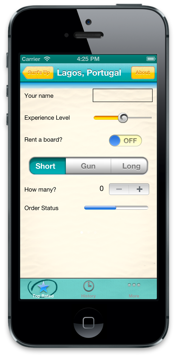
Customizing UISwitch
In iOS 5 you only had the ability to customize the tint of the On side of the switch (which was kinda a weird decision if you ask me). But luckily in iOS 6 you now have access to the Off side and the thumb (middle) part.
So, add the following code to set the tint colors customizeAppearance method:
[[UISwitch appearance] setOnTintColor:[UIColor colorWithRed:0 green:175.0/255.0 blue:176.0/255.0 alpha:1.0]]; [[UISwitch appearance] setTintColor:[UIColor colorWithRed:1.000 green:0.989 blue:0.753 alpha:1.000]]; [[UISwitch appearance] setThumbTintColor:[UIColor colorWithRed:0.211 green:0.550 blue:1.000 alpha:1.000]]; |
Compile and run, and check out your newly colored switch!
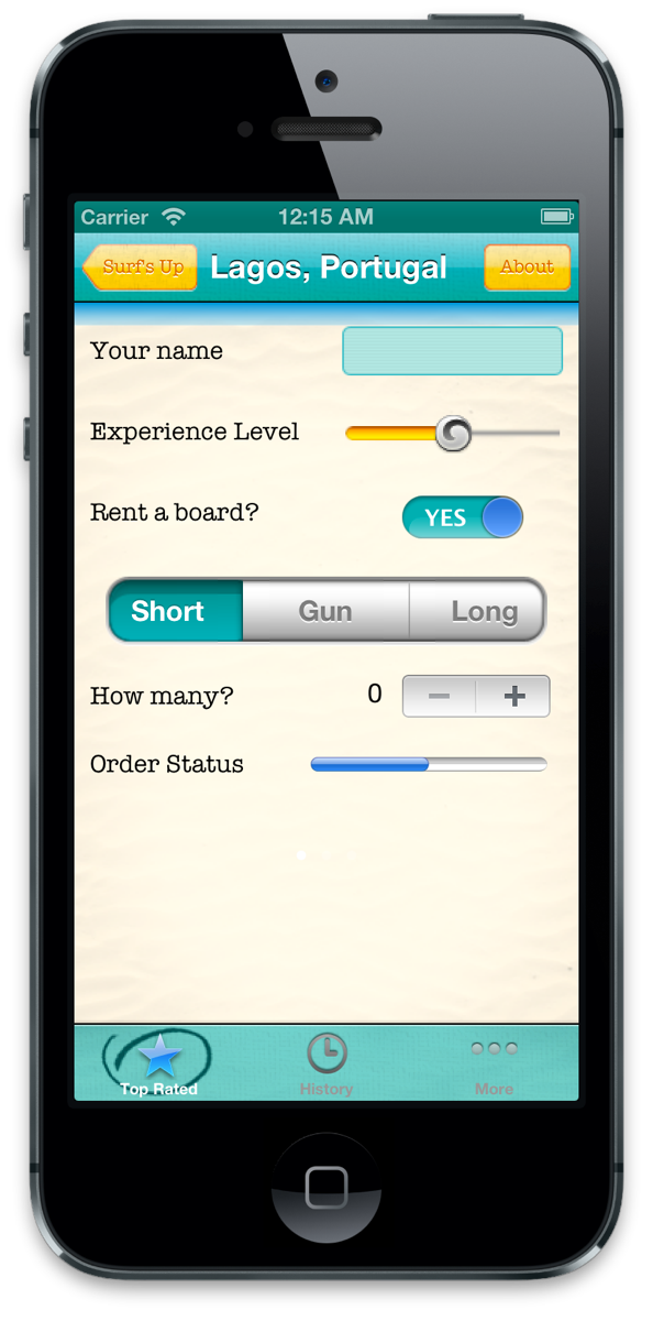
The switch fits the look now but “ON” and “OFF” don’t really make sense. I mean if someone someone asked you if you’d like a glass of water and you said “ON”, they’d probably look at you kinda weird. Well, it just so happens that in iOS 6 you also gained the ability to customize the images inside of the switch as well. It’s not text, but if you make an image that is text, it works just as well. Add the following lines at the end of the customizeAppearance method:
[[UISwitch appearance] setOnImage:[UIImage imageNamed:@"yesSwitch"]]; [[UISwitch appearance] setOffImage:[UIImage imageNamed:@"noSwitch"]]; |
Now the switch says “Yes/No” instead of “On/Off”! You could change this to an icon if you’d like too.
Things are looking pretty good, but you still have a couple of items outstanding. You need to update the labels and set the background of your custom UITextField.
Customizing UILabel
The labels are one part of the detail view you won’t customize via the appearance proxy. OpenDetailView.xib so that you can edit them in Interface Builder. Start by selecting the first label (i.e., “Your name”) in the main view, the in the Utilities view (i.e., the right pane), select the Attributes Inspector and set the following:
- Font: Custom
- Family: American Typewriter
- Style: Regular
- Size: 16
Repeat this for the four remaining labels: “Experience Level”, “Rent a board?”, “How many?”, and “Order Status”.
Compile and run, and now your labels have a neat typewriter feel!
::__IHACKLOG_REMOTE_IMAGE_AUTODOWN_BLOCK__::1
Customizing UITextField
Our UITextField has already been set to use UITextBorderStyleLine. Since we’re still in Interface Builder, let’s set the font to American Typewriter, Size 12, Regular. Now if you look at the Identity Inspector, you’ll see that the Custom Class has been defined as something other than UITextField – CustomTextField. If you look in the Navigator pane on the left, there is a group called Custom Views. Expand that, and you will see that you have a type called exactly that.
Right now the drawRect: method of your UITextField delegates to the superclass implementation. But in order to paint the teal background, you are going to override drawRect: as another customization technique.
Replace the implementation of drawRect in CustomTextField.m with the following code:
- (void)drawRect:(CGRect)rect { UIImage *textFieldBackground = [[UIImage imageNamed:@"text_field_teal.png"] resizableImageWithCapInsets:UIEdgeInsetsMake(15.0, 5.0, 15.0, 5.0)]; [textFieldBackground drawInRect:[self bounds]]; } |
Here you create yet another stretchable image with appropriate insets, and draw it in the rectangle defined by the bounds of this view (i.e., your UITextField). Let’s Build & Run…
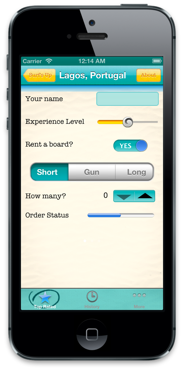
Customizing UIStepper
With iOS 5 you gained the ability to change the tint color of the stepper and now in iOS 6 you can change the individual icons in the sides and middle of the control. Let’s see how you can do this now. Add the following code to the end of your customizeAppearance method in SurfsUpAppDelegate.m:
[[UIStepper appearance] setTintColor:[UIColor colorWithRed:0 green:175.0/255.0 blue:176.0/255.0 alpha:1.0]]; [[UIStepper appearance] setIncrementImage:[UIImage imageNamed:@"up"] forState:UIControlStateNormal]; [[UIStepper appearance] setDecrementImage:[UIImage imageNamed:@"down"] forState:UIControlStateNormal]; |
Build & Run, and enjoy your stylish stepper!
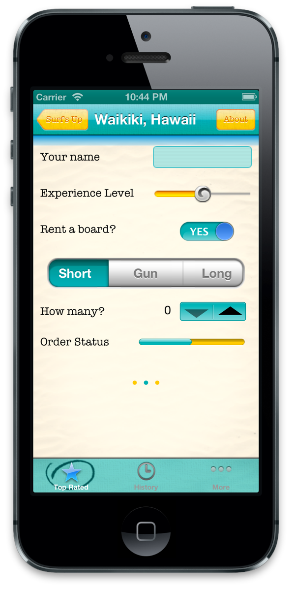
Customizing UIProgressView
The UIProgressView is a pretty simple control to customize, just a track tint and a completed tint. Add the following code to the end of your customizeAppearance method:
[[UIProgressView appearance] setProgressTintColor:[UIColor colorWithRed:0 green:175.0/255.0 blue:176.0/255.0 alpha:1.0]]; [[UIProgressView appearance] setTrackTintColor:[UIColor colorWithRed:0.996 green:0.788 blue:0.180 alpha:1.000]]; |
Give it another build and run and see your lovely progress bar

Customizing UIPageControl
UIPageControl is the last control we’re going to customize. You can customize the page indicators as well as a separate color for the current page, both properties are new to iOS 6. Add the following code to the end of your customizeAppearance method:
[[UIPageControl appearance] setCurrentPageIndicatorTintColor:[UIColor colorWithRed:0 green:175.0/255.0 blue:176.0/255.0 alpha:1.0]]; [[UIPageControl appearance] setPageIndicatorTintColor:[UIColor colorWithRed:0.996 green:0.788 blue:0.180 alpha:1.000]]; |
Build & Run… ahh, how beautiful!
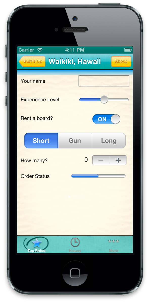
Congratulations – the detail view is complete, and you’ve learned a ton about customizing the looks of your apps!
Where To Go From Here?
Here is a sample project with all of the code from the above tutorial.
If you want to learn more about UIKit customization, check out our new books iOS 5 and iOS 6 by Tutorials! These books include 3 chapters on User Interface Customization in iOS 5 and iOS 6!
If you have any comments or questions about this tutorial or UIKit customization in iOS 5 and 6, please join the forum discussion below!
This is a blog post by iOS Tutorial Team members Steve Baranski and Adam Burkepile.